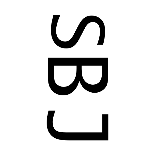
In the past 2 weeks I have been trying to get the basic functions of this website running. It is still very empty and definitely needs more content. But at first, I need to get some kind of identity running for my indie game dev journey to be recognized. So, there are questions regarding a logo and a color scheme.
Regarding the logo I recognized by accident in the last days that the first letters of Joy Burst Studios can be arranged to a smiling face with hair. Below you can see my very simple drawing of the process. The J as the smiling mouth and the B for the sunglasses were already set in the first attempt. I draw a circle around the 2 letters to make it clearer that it should be a face. The S should be the throat. I just switched the sunglasses up and down in the first 2 tries. Then I recognized that the S could be also a good hair alternative with a dotted circle. The final version right now has no circle anymore and for me it looks cool and minimalistic. To avoid any perfectionism, I will go on with this logo for now.

Still open to find a color scheme for Joy Burst Studios and filling the website content.
I wish you a burst of joy
JBS
